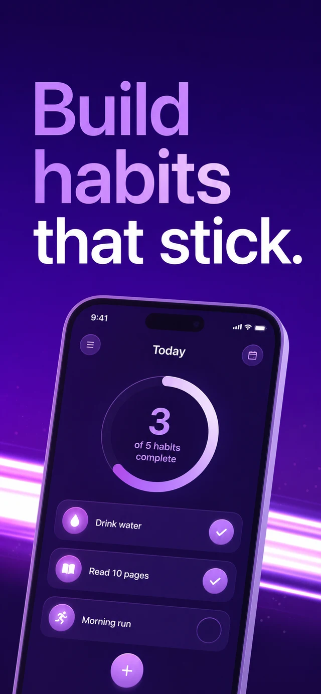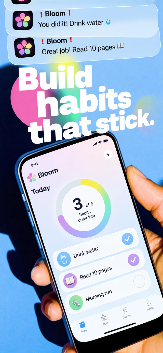
The apps at the top of the charts spend real money learning what converts, and their screenshot sets are the visible residue of a thousand A/B tests. We analyzed 47 of them across finance, health, lifestyle, and social. The patterns are strikingly consistent.
One idea per screen
Not one feature — one idea. The winners never cram. Each screen makes a single claim in large type, and the app UI below exists to prove that claim. Sets that try to show everything convert like they show nothing.
The chart-toppers don't have better features. They have better editing.
A palette is a strategy
Meditation apps own deep purples, finance apps own confident blues, Gen-Z social owns neon on black. The palette signals the category before a single word is read — and the best sets commit to it completely across all five screens.