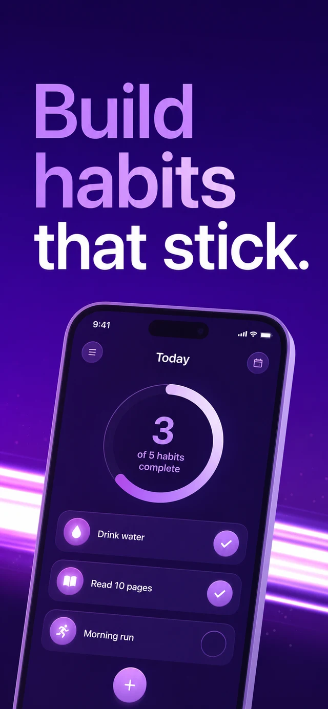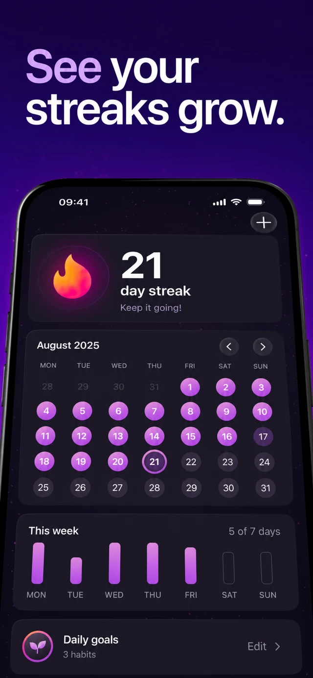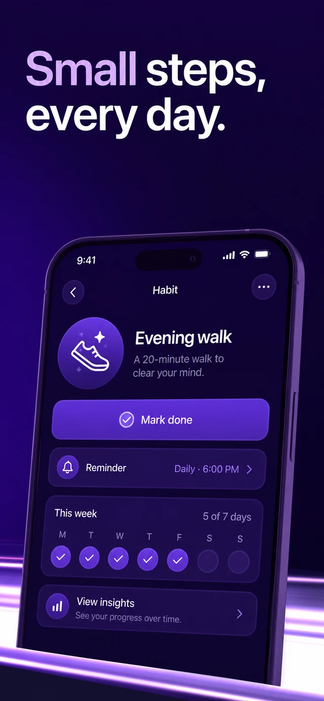
Nobody reads an App Store listing. They glance at it — for about three seconds, on a phone, probably while doing something else. In that window your screenshots either communicate what the app does and why it matters, or the thumb keeps scrolling. Every high-converting listing we've studied wins or loses on the same five decisions.
The headline does the selling
The screenshot's headline is not a caption — it's the ad. The best ones name the outcome, not the feature: "Fall asleep faster" beats "Sleep sounds library" every time. Keep it under six words, set it large, and make sure it survives being read at thumbnail size in search results.
Your screenshot is a billboard, not a manual. If it needs explaining, it already lost.
Device, background, and order
The device frame gives the UI credibility; the background gives the set a mood. Treat all five screenshots as one composition — a single color story that reads left to right. And put your strongest message first: most visitors never see slot three.